Hi, I’m Derek Watkins.
I currently build tools and data visualizations at Netflix. Before that, I was on the graphics desk at the New York Times.
Read about or watch me talk about how I approach solving visual problems, or browse selected projects below.

Who Gets to Breathe Clean Air in New Delhi?
We measured the pollution two kids were exposed to for a day, to see how much inequality makes a difference. Read more about the process here.
2020 Election Results Analysis
Bite-sized analyses of the election, published as results rolled in for battleground states.
How the Virus Won
A reconstruction of how the epidemic spun out of control in the United States.
How the Virus Got Out
Why the most extensive travel restrictions to stop an outbreak in human history weren't enough.
How Would Elizabeth Warren Pay for Her Plans?
A visual explanation of how Elizabeth Warren plans to fund her sweeping policy plans.
They Survived Hurricane Dorian. Their Community Will Not.
Surveying a Bahamas community destroyed by Hurricane Dorian, using drone video and photogrammetry.
How Two Big Earthquakes Triggered 16,000 More
A story and visuals showing how large earthquakes usually trigger thousands more.
Mapping the Whitney Biennial
Examining the geography of the Whitney Biennial over the decades.
Your Children's Yellowstone Will Be Radically Different
A 3D map of Yellowstone for a story about how climate change will affect the park.
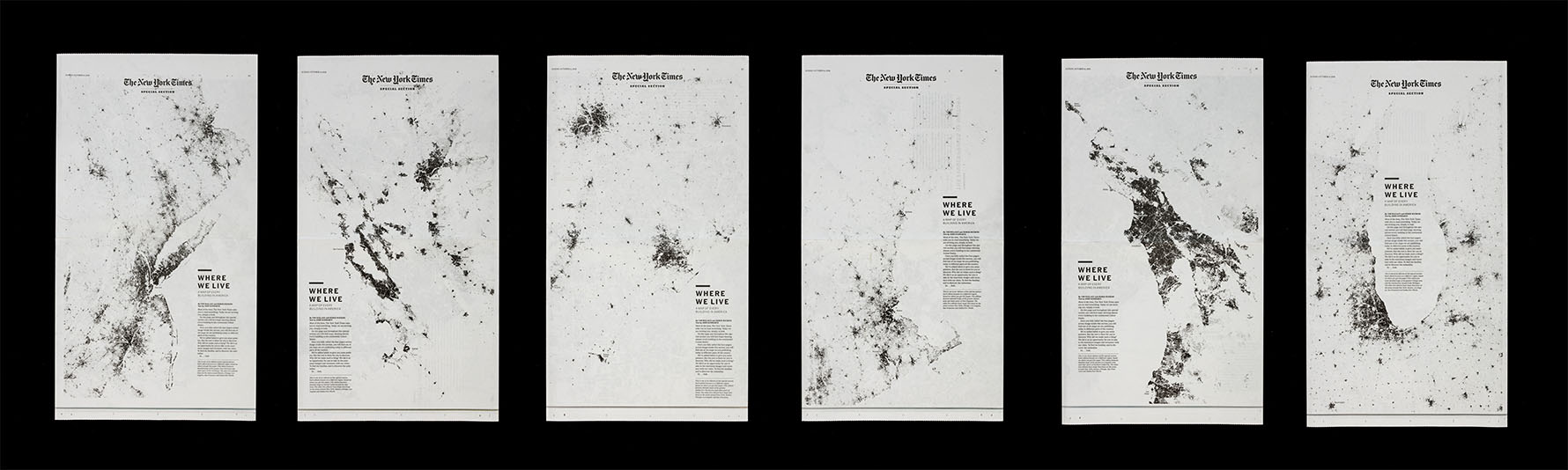
Every Building in America
An ambitious print-first project to visualize every building in America through a series of huge maps.
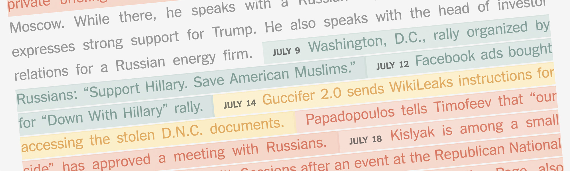
A Timeline of Russian Interference in the 2016 Election
Fitting together the puzzle pieces of Russian interference in 2016.
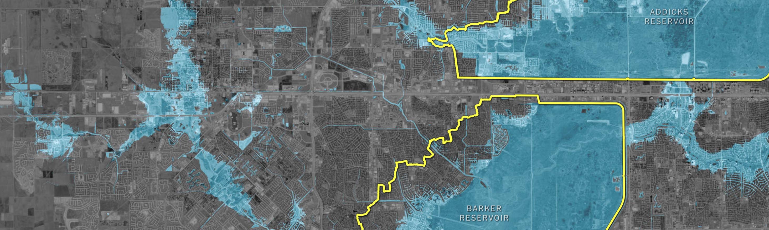
How One Houston Suburb Ended Up in a Reservoir
How urbanization and loose planning policies led a neighborhood to be built in the flood pool of a Houston reservoir.
Olympic Skier Animations
Whimsical race visualizations, published minutes after the end of Olympic ski events.
Town After Town Under Water
Reporting and drone work on a breaking news deadline after Hurricane Harvey.
Antarctic Dispatches
A three-chapter dispatch about cutting-edge climate science on the Antarctic ice sheet.
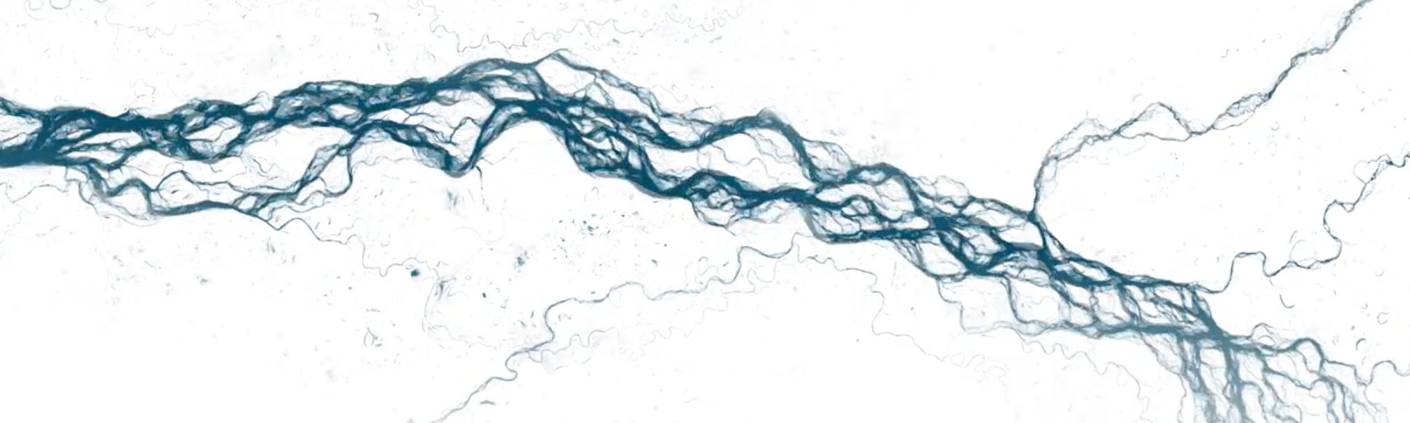
Mapping Three Decades of Global Water Change
Animating a new global water dataset to show how humans have changed their environment over the last 30 years.
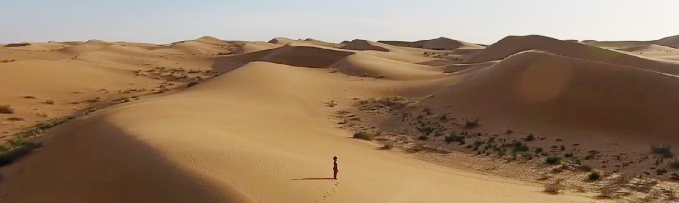
Living in China’s Expanding Deserts
Life on the edge of an expanding desert in China, through a seamless presentation of text, drone footage, and maps.

How One of the Deadliest Hajj Accidents Unfolded
The story of the deadly 2015 Hajj crush through the eyes of Rashid Siddiqui, presented with an eye towards how design and visual elements can augment a written story.
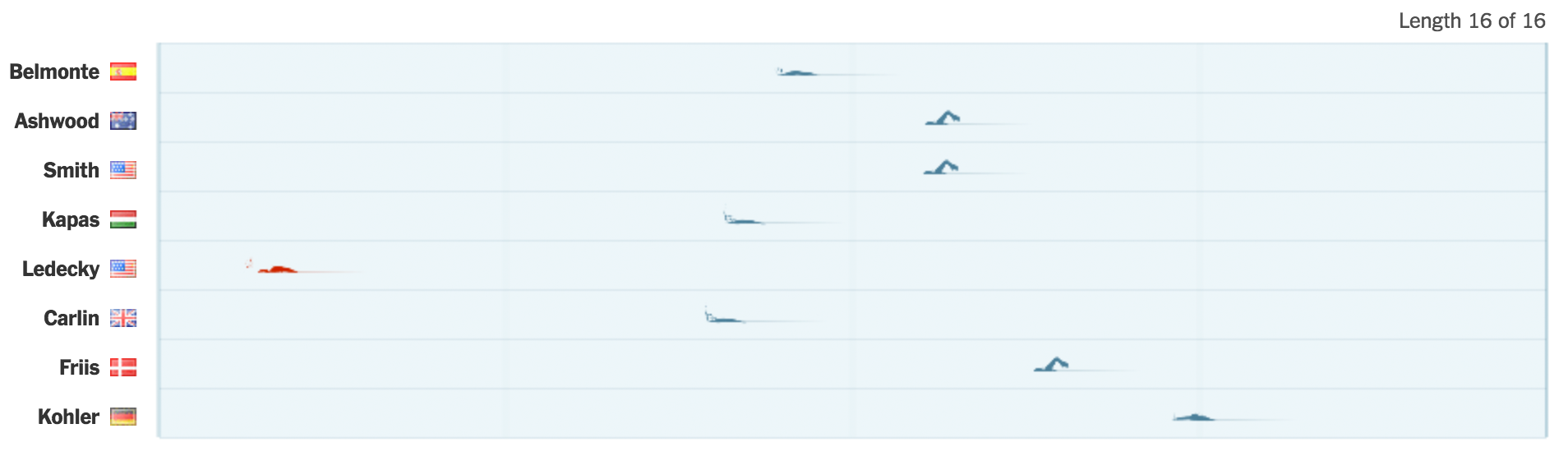
Katie Ledecky and the Eternity of 11 Seconds
Katie Ledecky dominated her races during the Rio Olympics. We put together this look at her performances in about six hours.
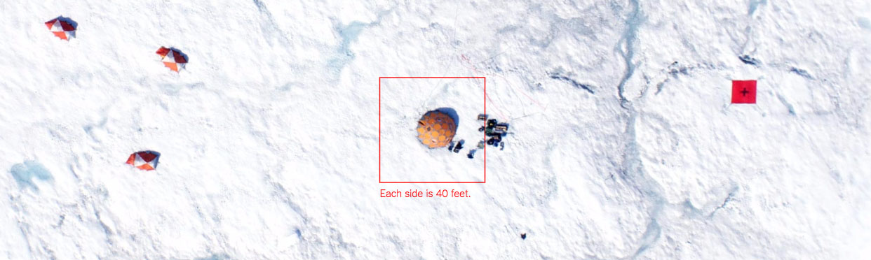
Greenland Is Melting Away
Drone footage, text and interactive graphics combine to tell a story about researchers investigating climate change with boots on the ice.
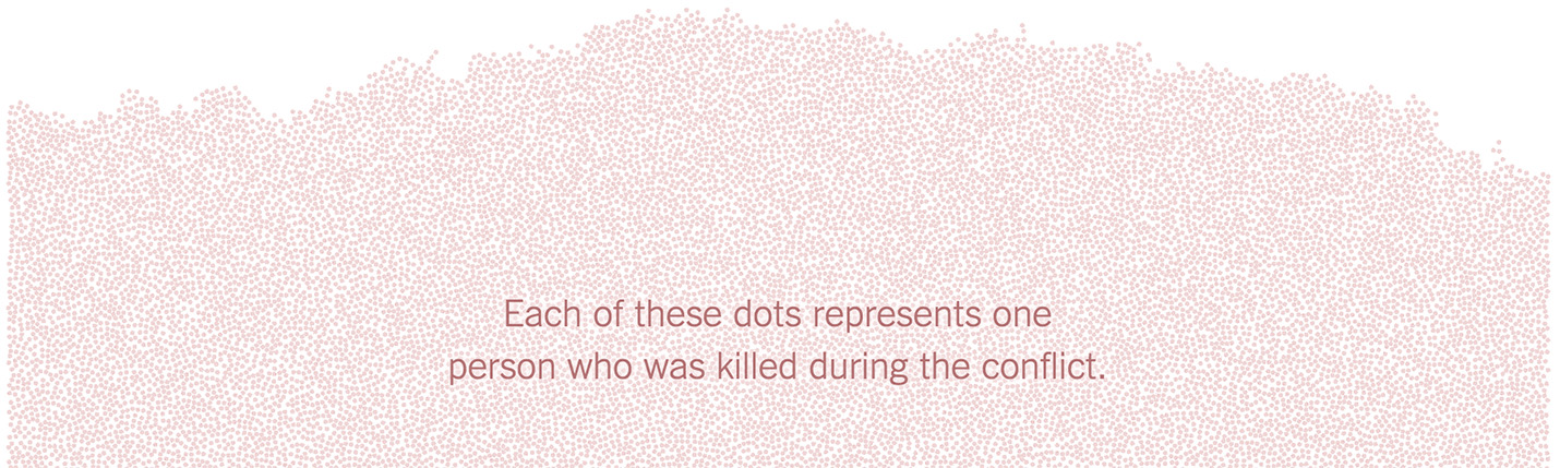
Death in Syria
An attempt to compassionately visualize every death in Syria's ongoing civil war.
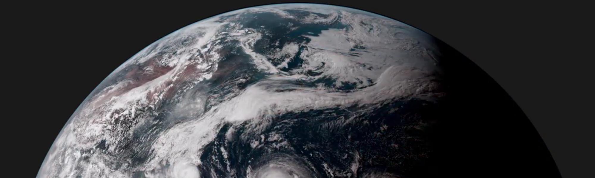
An Image of Earth Every 10 Minutes
10-minute snapshots of Earth from Japan's new weather satellite create elegant animations of our living planet.
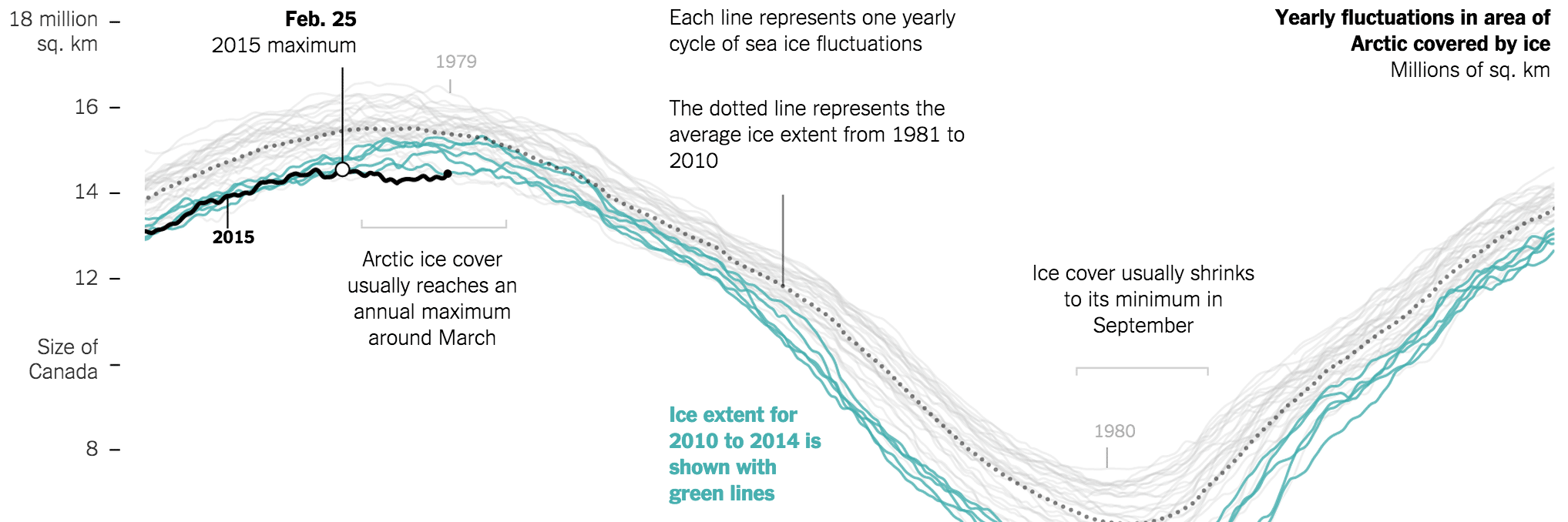
Arctic Ice Reaches a Low Winter Maximum
A short science article with integrated charts and graphics about sea ice extent in the Arctic.
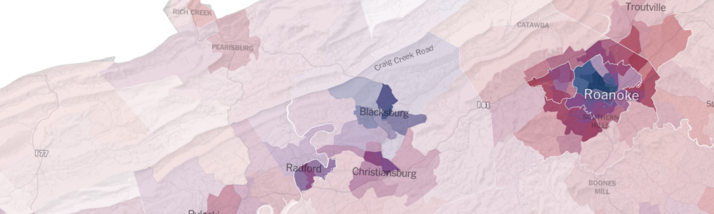
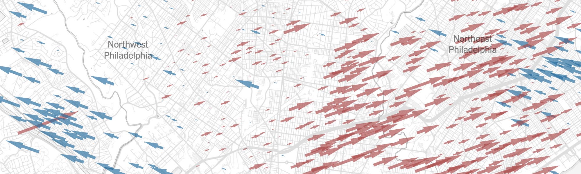
The Most Detailed Maps of the Midterm Elections
Maps of precinct results for key states during the 2014 midterm elections, published the morning after.
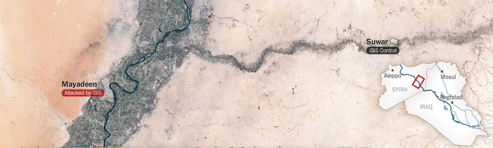
A Rogue State Along Two Rivers
How ISIS came to control such large swaths of territory, framed by the meanders of the Tigris and Euphrates rivers.
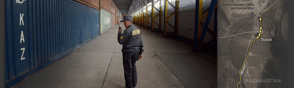
Riding the New Silk Road
Tracing Hewlett-Packard's overland route for shipping electronics from China to Europe.
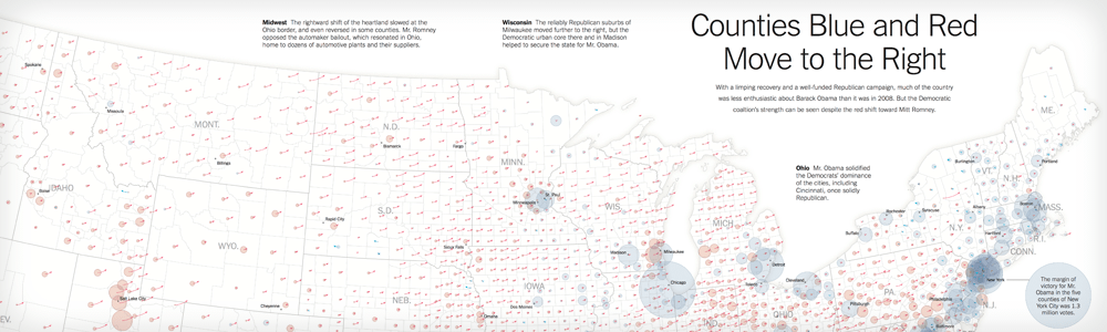
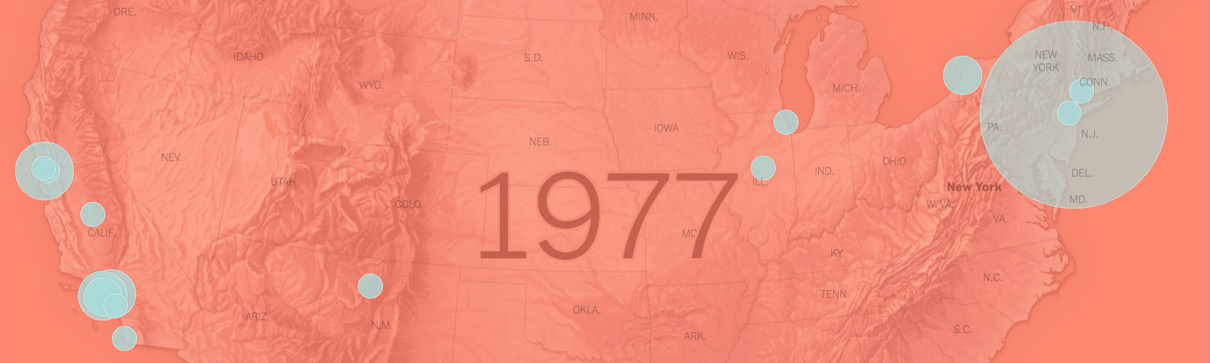
Counties Blue and Red Move to the Right
Two-page print graphic illustrating differences between the 2008 and 2012 presidential elections.
Recognition
2020
Malofiej 28 Gold, Best Map — How Two Big Earthquakes Triggered 16,000 More in Southern California
NYT Publisher's Award How the Virus Got Out
2019
Malofiej 27 Gold, Best Map — Hell On Earth: The first 12 hours of California’s Deadliest Wildfire
Malofiej 27 Gold — Winter Olympics coverage
2018
Emmy Awards News & Documentary Nomination: New Approaches — 10 Minutes. 12 Gunfire Bursts. 30 Videos. Mapping the Las Vegas Massacre
World Press Photo multimedia awards 3rd Place, Long Form — 10 Minutes. 12 Gunfire Bursts. 30 Videos. Mapping the Las Vegas Massacre
Malofiej 26 Gold, Best Map — A Shifting World of Ice and Rock
Malofiej 26 Best Graphic: Climate Change — Antarctic Dispatches
2017
Emmy Awards News & Documentary Nomination: New Approaches — Carbon's Casualties
Picture of the Year International First place, Online News & Issue Story Editing — Living in China's Expanding Deserts
Picture of the Year International Documentary Project of the Year — Carbon's Casualties
Associated Press Sports Editors Award Olympics Graphics
NYT Publisher's Award The Solar Eclipse
NYT Publisher's Award Graphics desk coverage of Hurricane Harvey
NYT Publisher's Award Antarctic Dispatches
Malofiej 25 Best of Show & Gold — Olympic Races social series
2016
World Press Photo multimedia awards 2nd Place, Innovative Storytelling — Greenland Is Melting Away
Picture of the Year International Finalist, Documentary project of the year — 10 Years After Katrina
Picture of the Year International 3rd place, Online News & Issue Story Editing — Greenland Is Melting Away
NPPA Best of Photojournalism First Place, Team Multimedia Portfolio
NPPA Best of Photojournalism Best of the Web Multimedia — Outlaw Ocean
Webby Awards Best Individual Editorial Experience — Greenland Is Melting Away
Webby Awards People's Voice: Best Individual Editorial Experience — Greenland Is Melting Away
Malofiej 24 Silver — Individual portfolio
Society for News Design 37 Silver — Individual portfolio
2015
AAAS Kavli Science Journalism Award How Ebola Roared Back
Associated Press Sports Editors Award The Dawn Wall: El Capitan's Most Unwelcoming Route
Malofiej 23 Gold, Best Map — The Most Detailed Maps You’ll See From the Midterm Elections
Malofiej 23 Gold, Best of Show — Areas Under ISIS Control
2014
Webby Awards Nomination — A Game of Shark and Minnow
National Magazine Award Nomination — A Game of Shark and Minnow
News & Documentary Emmy Awards Nomination: New Approaches — A Game of Shark and Minnow
Gerald Loeb Award Interactive Graphics Portfolio (team)
Malofiej 22 Gold — Reshaping New York
2013
NYT Publisher's Award The Bloomberg Years
Malofiej 21 Gold, Best Map — Counties Blue and Red Move to the Right
Malofiej 21 Gold — Hurricane Sandy portfolio (team)
Malofiej 21 Gold — London Olympics portfolio (team)